Successful Data Projects, Part II: Work that Data

As a project manager, you quickly learn no two projects are ever the same. Whether it's the client, team, or content itself, there's always some level of unpredictability. Over the past year, many of Intridea's projects have revolved around data visualization, with large data tables or many datasets.
With their enormous levels of data and unknown variables, data projects can easily be intimidating. They don't have to be though!
In the next few weeks, I'll be laying out the basics for data projects; enabling you with the tools and resources to make any project a success.
Last week was all about defining responsibilities and deadlines. This week, we learn how to "work that data"...
Work that Data: Participate in Discovery
Having an in-depth understanding of the data you're working with is pivotal to grasping the quickest route to effective data visualizations. Clear requirements or not, you have to complete data discovery to ensure data points will support client requests. Completing data discovery before the design phase, allows your team to uncover patterns and reveals knowledge about the data. This discovery step is essential, and directly impacts how the end user will utilize the data.
Every set of data contains a plethora of answers; the art is in asking the right questions. Data doesn't naturally highlight the pitfalls ahead or the series requiring extra effort. It doesn't detail data points or leave a trail of hints about the stories it will illustrate. You have to manipulate the raw data in order to understand how your visualizations will represent it.
In my experience, there are three key routes to successful discovery. Follow these steps, and the answers you find are guaranteed to inspire and guide your team to the final design...
Explore data (column by column) to pinpoint outliers and inliers.
- Where would this data be displayed? Is it metadata (chart titles, sources, notes) or core data (to be featured in the visualization)?
- What is the largest character count entry in this column? Smallest? How could this impact design?
- What is the outlier of data for the column? What kinds of gaps do you have separating those outliers from the majority of your data points?
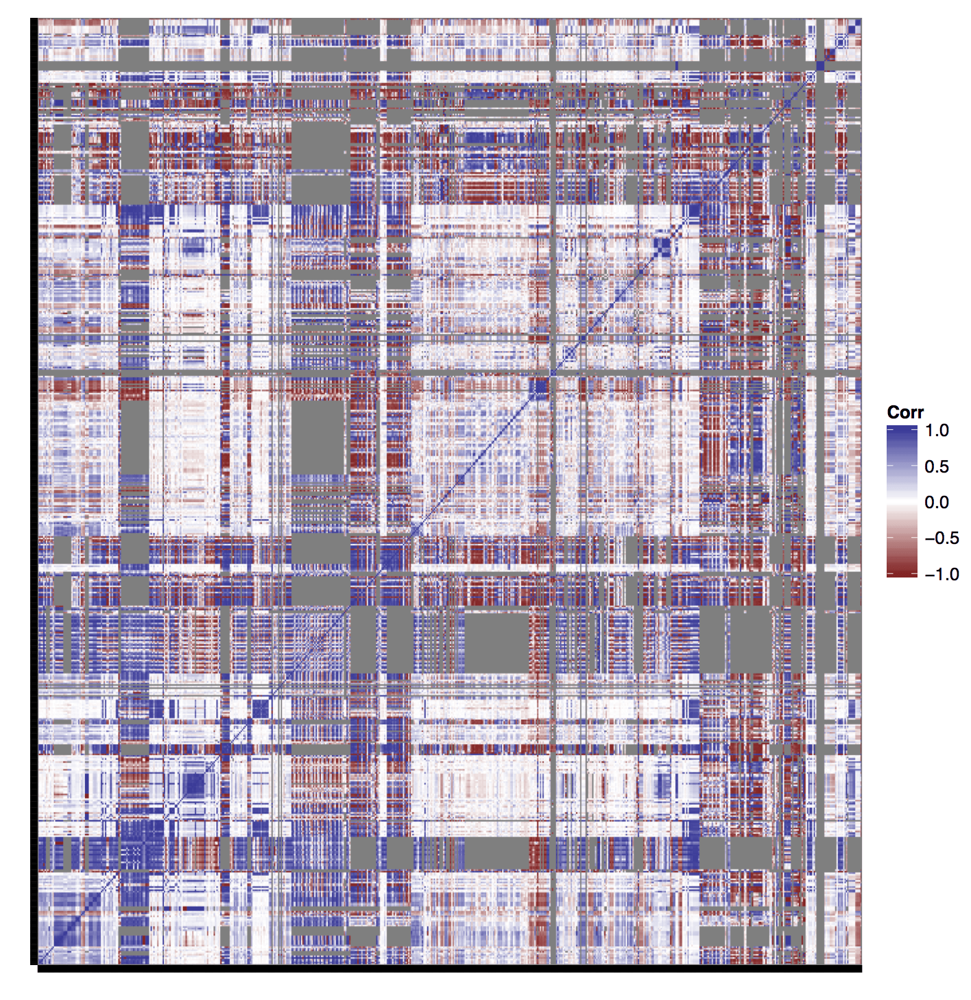
Create a correlation quilt. It's helpful to answer the following questions (especially when your site allows data comparison):
- Are any groups of data overlapping data points (particular years, countries, or sources)?
- Are any parts not overlapping or correlating? Note: edge cases will lie in these areas.
- Are there repeat groupings that lend themselves to comparison?
Example of a correlation quilt: 
Identify patterns of repeating variables to discover areas for normalization.
- If you have a column of years, ensure no decades are listed, and all items are in identical four number year pattern (ex: 1990s).
- Notice countries being listed in various ways (abbreviations, older names, olde english spellings, etc)? Make sure to normalize all references, example change “UK” to “United Kingdom”.
- Depending on the data type you're dealing with (number vs long-form-text vs abbreviation) eliminating superfluous punctuations and symbols like “&” can be helpful for future data cleaning and are often easiest in the early stages of programming.
While barely scraping the surface, these questions are a great place to start. Completing data discovery, before digging into design, will eliminate a lot of backtracking, misunderstanding, and (insert frustration here). It enables your team to find trends, as well as fully understand every aspect of the data. So what are you waiting for? Go work that data, and discover the stories it's waiting to tell!
Got any ideas, tips, or resources for managing big data projects? Let us know!
Want to learn more? Check out the entire Successful Data Project series below!
