Reasons Sketch Has Become Popular For Interface Design

The short answer, yes, Sketch is becoming a popular choice for interface design. Two years ago a new race commenced when designers started looking for a faster and cheaper alternative to Photoshop, which at the time was the market leader- I don't think anyone is doubting that Photoshop is still the most commonly used tool in the market but Sketch entered the race and has made quite a positive impact for another designer tool option.
What is sketch?
Sketch is a development tool for UX and UI designers - it is vector based tool entirely focused on the user interface design.
Sketch identified a gap in the market and started to capitalize on items that Photoshop seemed to be missing. Aspiring to be an icon company of the 21st century and a customer engagement champion at heart, Sketch successfully transformed into one of the most usable tools for UI designers. Sketch was perceptive to the needs and behavior of their clients. They understood how to cross all barriers we assumed were set in stone.
Here are some basic differences between the two:
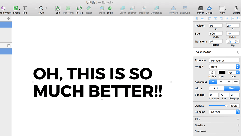
- Rendering is similar to web: Sketch uses native font rendering, so the text is sharper and more accurate looking than Photoshop.
- Vectoring vs Raster: Today there are different kinds of pixel counts and screen sizes that exist- vector images scale much better when compared to raster images or bitmap graphics. When you work with a vector graphic, you will notice that the image is solid and holds its shape after you zoom in, on the other hand if you zoom a raster graphic you will observe that the pixels and the image is distorted.
- Smart Guides: You can add as many guides as you want by clicking on the ruler and it allows you to perfectly align all of your layers. Also you can easily see the guides and spacing between objects by holding down the alt key.
- Built-in Grids: A designer cannot live without grids. With Sketch you can easily create your own grids and change the column sizes on the fly. Without the grids it is a real challenge to create awesome designs in a short-time period.
- Exporting: When it comes to exports, Sketch is a clear-cut winner. You can easily export your artboard into a pdf file to build a presentation with your application workflow. You can export your artboards in different formats like JPG, PNG, PDF and even two times for retina display.
- Speed: Sketch seems to be much faster and works smoother than Photoshop. It's a fast application which is intentionally minimal in its offerings. The result is less time thinking about how slow the software is and more time designing. This makes it way easier when working with complex workflows. Sketch is only 45MB compared to Photoshop CS6 and its 4GB.
- Sketch Mirror: Another cool feature that comes with Sketch is the possibility to mirror your artboard directly in your iOS device. So you can easily test it and see how the designed screen will look without having it implemented in the application.
Sketch really outdid themselves when they came into the market- this allowed designers to use another program that may cater to their needs more specifically than Photoshop, and at a cheaper price.
Which program do you use? Photoshop, Sketch or both?
