User Interface In Flat Design
Flat design is no longer a trend but a design language that is best used for user interfaces in the digital realm. For some time interactions with the “black mirror” features a cleaner style that does not need resort to real world metaphors like raised buttons, textures, shadings and shadows. Everyone knows that the touchscreen is meant to be touched and most apps or websites contain certain actions that we as users are supposed to take. Flat design is a step ahead in terms of readability because screens are not always in the highest retina display resolution. It feels natural for the system to find its own graphic language that's not mimicking physical objects but it has been observed that some users can have a hard time recognizing actionable elements within flat designed interfaces. A radical expression of this style may leave a bunch of users clueless about what they can do within the app or website. Operative systems' design languages do offer some design elements like shadows in order to imaginarily place elements at different depths of the screen. The challenge of a purely flat interface design is making sure you (the designer) are making the user understand which items are meant for interactions - be deliberate with the shapes, colors, and margins.
How can we tell when something is actionable?
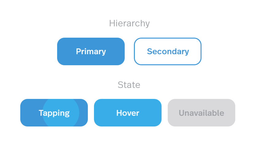
If we are going to keep the design strictly flat we will need color and context. For the most part the content, aside from images or videos, will be dark text over a white (or bright) background. Of course we are keeping it simple here, it could be the other way around (bright text over dark BG) or even color blocks where the text has enough contrast. But typically the first case is the better option for readability. Let's start by talking about buttons. The most clear call to action button is typically words that are on a button that indicate what your user should do by clicking on that button. The call to action is typically a word or short sentence expressing an action - enclosed in a flat colored rectangle shape (no matter how round or square its corners may be).  If the button has a strong color accent on the screen, its place as a CTA (call to action) is evident. As seen in the figure above it is possible to have style variations for secondary actions that we don't want to emphasize, as well as disabled actions (as long as there is something the user can do to enable them). It's important that the “air” around the word is enough for the element to be recognized as a button, but not that much for it to end up being a huge color patch on the screen (which starts to defeat the original purpose of playing along with content). We can see in figure 2 below that by using the exact same style but minimizing the margins around the word the element loses its button purpose. If it is used that way the call to action still poses an actionable property, maybe as a selectable item with on/off states or an item that is draggable:
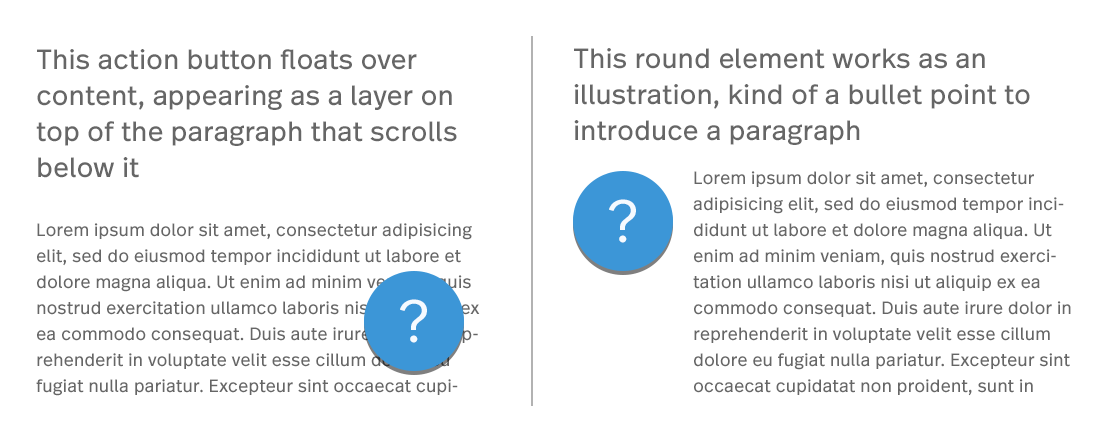
  Other buttons that are flat with no words may be useful for some situations even if they are less evident for the user. The trick for those is to have an action related to their context and visually be in the correct position. We can see in the next image below that the same round element can play different roles depending on its placement in relation to the content on the page. Google's material design guidelines feature the “floating action button” which floats above the content carrying the main action intended for that screen.
  Icons have a similar two-face behavior. They can either be an active element to interact with and perform an action or an illustration supporting and decorating a message resulting in no user interaction whatsoever.
  Back to my original point, context is everything - once the context is in place, the user experience typically follows as to what action you should or should not take. Through users' past experience with navigating different digital platforms the user will quickly identify the icons on the top and bottom borders of the screen are a means of navigation. Normally icons over a certain size that are placed just above or to the left of a paragraph serve as an illustration element. Other positions and size ratios invite the user to interact as it becomes apparent they represent actions related to the piece of information that precedes. While not always depicted in color, we can see here the contrast color helps to distinguish them as something actionable:
  Tabs, fields and dropdowns pose less trouble- they do have a similar style because they have been a part of UIs for a long time. Their typology is strongly installed in users minds however, fields are the most striped down ones of the group, sometimes styled in a really minimalist manner. For example, imagine a line acting as a row with a label above it mentioning the expected input. A rule of thumb for fields is that the labels should be aligned to the left since we type and read from left to right so the text input is prepared for the content it expects. That would be one of the main aspects that help reveal their function because as we can see in the following deliberately inflated examples the line dividing one type of element from the other can be very thin, coming all down to type style and alignment:
  Flat design is the standard today, but as technology evolves devices transform and new type of design interactions are needed. Due to graphic resolutions and computing power growing higher each product generation we are seeing subtle but powerful graphic effects starting to get into the mix. There's always a learning curve for users, but as designers we should at the very least not stand in their way!
