Making Complex Data Simple and Beautiful
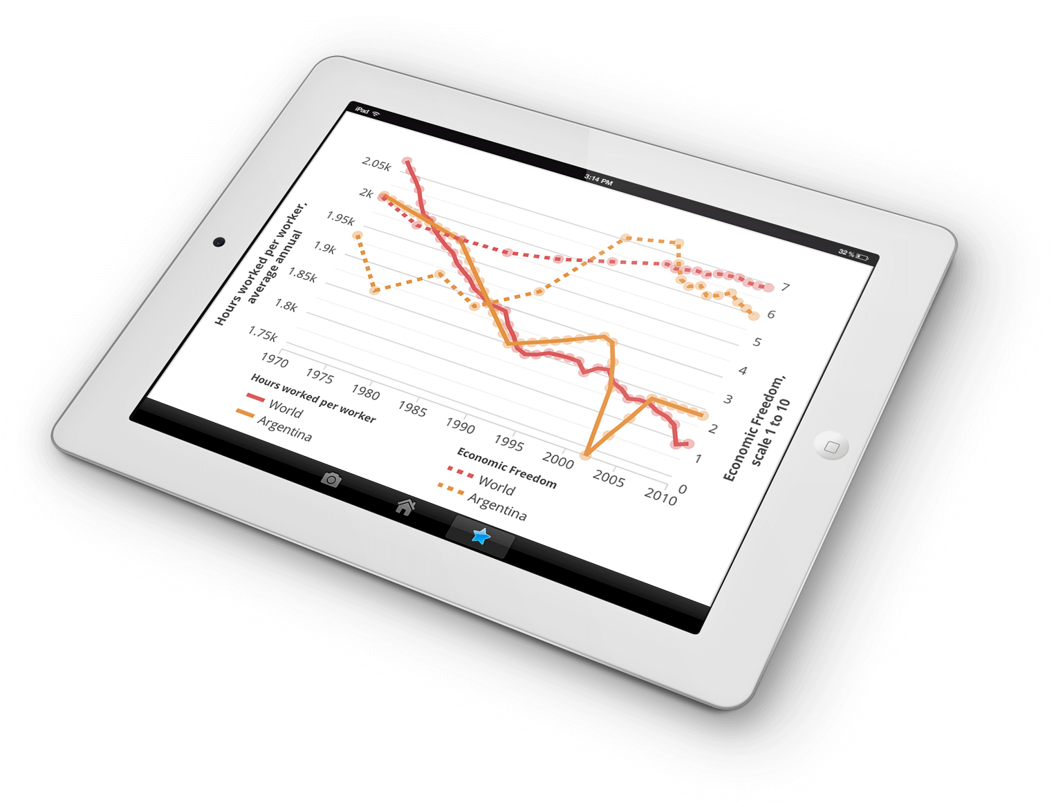
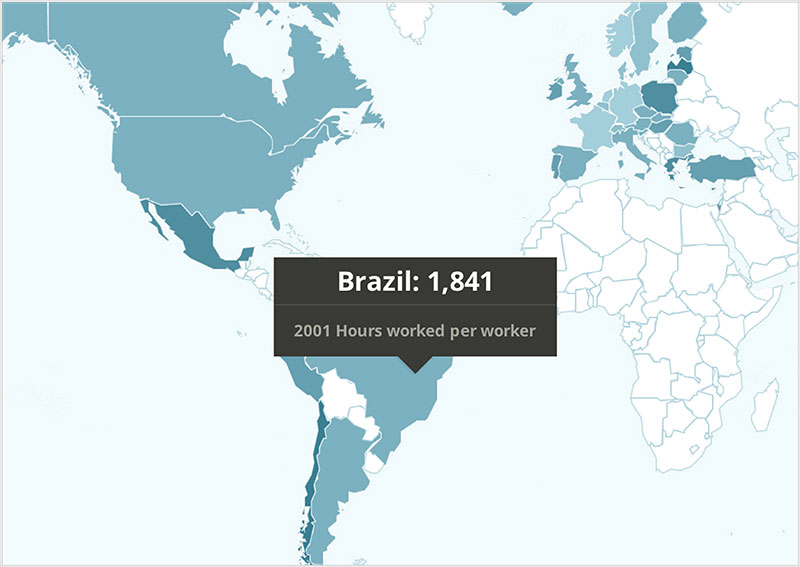
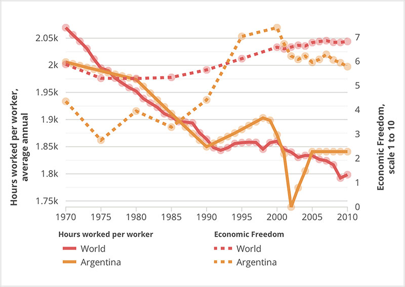
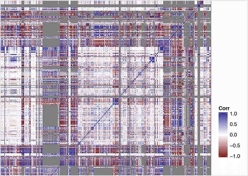
Now having a clear understanding of our underlying data sets, it was incumbent on us to find beautiful and simple ways to visualize this data. A combination of choropleth maps, line and bar charts, and simple, summarized statistics enabled us to do this elegantly—even across widely-varied data outputs.


Most of the visualization display a range of data over countries and years. With this data we're able to create an animated map to show human development indicators for countries across the world as they change over time. Additionally, users can compare the rise and fall of human development indicators with a country ranking tool.
We were able to achieve these great visualizations through the strategic use of several JavaScript libraries including Mapbox.js, D3.js, Backbone.js, and Marionette.js.


Breaking New Ground for Visualizing Human Development Indicators
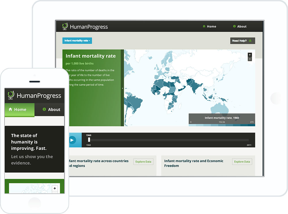
In the past, many websites chose to visualize human development indicators using Adobe Flex or Flash. We were fortunate to be working with a forward-thinking client like the Cato Institute, allowing us to build in HTML, CSS, and JavaScript. The results are a responsive data-driven website that works well across platforms and browsers.
This is now the best source of human development indicator data on the web, and since we also added the ability to export the maps, charts, and raw data, these data and visualizations are freely available for anyone to use and analyze.
Project Needs:
Data Science, Rails, Data Visualization, User Experience, Human Development Indicators
Key Technologies:
Data Science, Rails, Data Visualization, R, User Experience, Human Development Indicators
