Federal

NOAA
FISHERIES

The National Oceanic and Atmospheric Administration (NOAA) Fisheries, also known as the NOAA National Marine Fisheries Service (NMFS), is a federal agency responsible for the stewardship of the nation’s ocean resources and their habitat. Their services include: conservation and management of U.S. waters to promote prevention of overfishing, declining species, and degraded habitats. NOAA Fisheries manages five coastal regions broken down by department, fisheries management, science centers, and labs. Each office ran their own independent site creating inconsistency and overlap in content and design as each isolated digital property.

NOAA Fisheries

The National Oceanic and Atmospheric Administration (NOAA) Fisheries, also known as the NOAA National Marine Fisheries Service (NMFS), is a federal agency responsible for the stewardship of the nation’s ocean resources and their habitat. Their services include: conservation and management of U.S. waters to promote prevention of overfishing, declining species, and degraded habitats.

NOAA Fisheries

Unifying their content.

In late 2016, Mobomo partnered with NOAA Fisheries to assist in restructuring and redesigning their digital presence. Merging all their core web properties into one Drupal site. Allowing users to go to one destination to find and discover information they need. Focusing on improving content efficiency, design consistency, and unifying NOAA Fisheries voice. Within one year we launched the framework for their next generation site.

Key insights

  • Mobomo discovered a lot of potential automation to reduce the workload for content editors.
  • Out of each property, only 100 pages were visited daily helping to prioritize what content should be archived or migrated.
  • NOAA Fisheries led the way in a new writing style guide to help unify the language.

putting the site structure to the test.

Before the start of the project, NOAA Fisheries worked with Foresee to help gather insight on their current users. NOAA Fisheries wanted to address poor site navigation, one of their biggest complaints. They had concerns over their new site structure and wanted us test proposed designs and suggest improvements.

In our evaluation, we ran two types of user tests targeting four key audiences; government, non-government scientists, fishermen, and educators. This process took over two months to complete, during which we ran 6 rounds of tests.

01

First Test: How users group & label items

We started out our evaluation by testing how users group items compared to the current sitemap. We used Optimal Workshop, a digital card sort for speed and to connect use to NOAA’s diverse audience. We tested over 100 people across all audiences in one week and discovered that the majority were not using the technical vocabulary that NOAA was using in their navigation concept. We then selected key categories and ran another test to see if users could still group all the items in our new groups. As a result, we removed technical terminology that caused confusion, improving their success rate by 13%.


Key Insights

  • Fishing, Rules & Permits, Science & Data, and About Us were the most common phrases across all audiences.
  • Technical terminology like Management, Fisheries, Endangered did not appear in two key audiences.
  • When asked, fisherman said they understood technical terminology, but used and preferred layman terms.
02

Second Test: How users interacted with the structure

After the first round of sitemap revisions using the tool Slickplan, we wanted to validate our sitemap again with our audiences. We used Treejack, a digital navigation tool that allows users to not only test the top level navigation, but secondary and third levels as well. We conducted four rounds of testing focusing on only 10 individuals per audience. During each round, we focused our iterations on where users clicked, improving task success as well as user directness. Our final sitemap scored 91% success rate, which rose from 13% on the first iteration.


Key Insights

  • Showcasing related topics under each navigation item increased discoverability.
  • Using the phrase location caused confusion, so the term remained regions.
  • Key audiences were unfamiliar with the term ecosystem, so environment was used instead.

Working around
the complexity.

The NOAA Fisheries site is more than a conveyor of marine life information and research. It offers a large variety of information; from summaries of upcoming rules, permits, funding opportunities, to various types of helpful resources. Each section had its own challenges for us to learn and develop automated solutions around. The goal was to automate and simplify the content for users to locate, as well as for editors to post and manage.

01

Pushing for Dynamic Content

A unique aspect about NOAA Fisheries’ content is that their subject matter can cross over various topics and subtopics. This became a challenge for the information architecture and development team to ensure different content types were able to show up where they might be expected across the site. This was one element NOAA Fisheries wanted to remove and streamline. As a result, we employed the Create Once Publish Everywhere (COPE) philosophy and built topic templates that provided auto populating feeds based on each custom tab in the template. Now, users can go into a topic and easily skim the background information based on a sub-area of interest.

Key Insights

  • The lack of content similarity between the 20 topics created a challenge. This left us to allow each topic to select their own sub navigation, which would then dictate what content would appear.
  • We also moved all their static resources, like downloading PDFs, tools, and maps to a template. This provides power to users to search for content and for it to be featured in related feeds across the site.
  • We created three unique content templates that editors could select from in order to build and tag their content.
02

Simplifying fishing rules & regulations

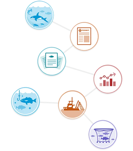
NOAA Fisheries does a great job interpreting the technical information posted on the Federal Registry for fisherman. The development team wanted to continue that message throughout all aspects of the rules that NOAA Fisheries covers. We worked to understand the nuances and frustrations of users and created a key directory that allows fishermen to toggle between what matters most to them. This enabled them to view a weekly fishing update, any upcoming rule changes, or simply view all the rules for the type of species. All of this was to help fisherman quickly find what they needed to know before they go out fishing.

Key Insights

  • Each region has a series of management plans that covers species and each plan contains rules or actions. During the process of a new rule or a rule change, NOAA publishes bulletins to document these updates.
  • The region dictates the fish and the rules around catching it.
  • Each rule follows multiple phases, from Information Gathered to Final Rule.
03

Expanding species profiles

The biggest draw to NOAA Fisheries’ site was their protected species profiles pages. In our user testing we found that the majority of users were looking for key information under a species profile. We worked together to create a new framework of common key information for these new profiles. The goal was to provide a simple overview of information for the general public, a scientific area for the scientists, and rules & regulatory information for the fisherman and government employees. Furthermore, to offer an easier view of species, we created species directory and category views.

Key Insights

  • Our team expedited the content created and built an API to pull content from another NOAA site called Fishwatch.
  • NOAA Fisheries actually manages over a thousand species, but not all of them need profiles.
  • A challenge between contrasting differences in a protected species versus a managed species lead us to create two different versions of this template.
Key insights

Designing for success.

Rapid prototyping & iteration

Communications and expectations are key to the success of any project. We used Invision to transform our flat designs into clickable prototypes and allow NOAA Fisheries to better visualize how their site would look and act. This created an expectation for NOAA Fisheries, as well as the development team. This let us test the experience of the user flow. However, as the project grew, we switched to Webflow, an interactive web builder, to better showcase responsive design and better interaction. As a result, we had built an interactive reference for both the development team and the stakeholders to use throughout the entire project.

Building a Design System.

Consistency is the most important aspect of a site, especially with larger projects like NOAA Fisheries. Instead of updating online brand guidelines, the solution is documentation and implementation of reusable components, templates, and styles to allow for a plug-and-play type of development for templates and features. The style guide of all the modules/symbols, colors, and styles was first created in Sketch and subsequently moved to Webflow to adhere to more of a site structure.

Noaa Fisheries

ELEGANT
SOLUTIONS
START
HERE.

Content-rich websites. High-performance mobile apps. Bulletproof cloud solutions. Bring us your toughest challenge and we’ll show you the path to an elegant solution.

Contact Us

New project request.