Guerilla UX: UX in the Analog World
As a UX designer, improving the end user experience is my passion. When an interface or interaction seems confusing, I often find myself asking “What would I tell the user if I was there?” And immediately picture myself as a bystander, brainstorming every possible solution.
When you eat and breath this on a daily basis, it can quickly spill into the analog world. Suddenly, you have a heightened awareness of places and things where designers have built with the user in mind. And it's in those instances, you can almost sense the designer looking over your shoulder, giving you a helping hand.
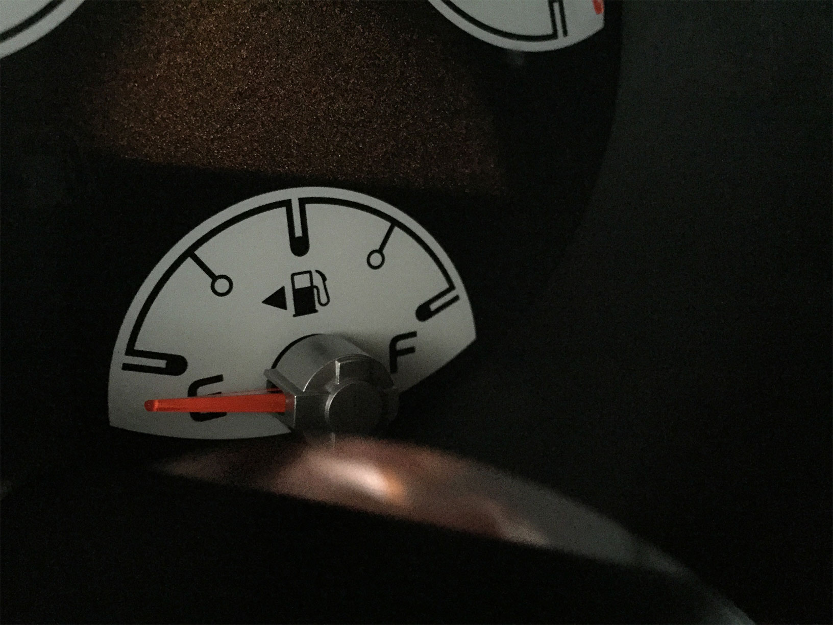
My first observation of this was the gas pump. We've all experienced “gas cap confusion” or the internal debate as to which side that dang cap is on! No matter how long you've been driving your car, this situation occurs more often than we'd like to admit. If you know where to look though, there's a bit of user experience design making life a little easier. For years auto manufacturers have included a tiny arrow next to the gas pump icon indicating which side it's on.

It's such a simple touch. Just a tiny little arrow. But if you know about it, it can save you a world of frustration when heading to the pump.
Which got me thinking, are there other ways to simplify daily life via user experience design? And so began my pursuit and practice of Guerilla UX.
When we moved into our house, a point of frequent confusion was our garage doors, or more specifically the control panels that opened them. There's a garage door on the left and another on the right, but with the panels stacked vertically (poor user interface design) it was impossible to remember! With a bit of Guerilla UX though, determining which pad opened which door was quickly resolved. Arrows now clearly indicate the side the control panels open.

Another place with some added UX love is my printer. It's a common hurdle; which side of the paper will the printer print on? And it's of special concern when printing on special paper or making labels! Pre-UX, I'd always make a mark at the bottom of a plain sheet of paper and print a test page to avoid wasted time and paper. My Guerilla solution? A simple label with an arrow showing which direction to load the paper and a smiley face to indicate the top as well as what side it will print on. Tada!

These are just a few places I've added Guerilla UX to my daily life, but I have a feeling other designers (and non-designers) may use a bit of Guerilla UX to make their lives easier too.
Got some good examples? Tweet them to us with the hashtag #GuerillaUX and we'll share the best ones!
