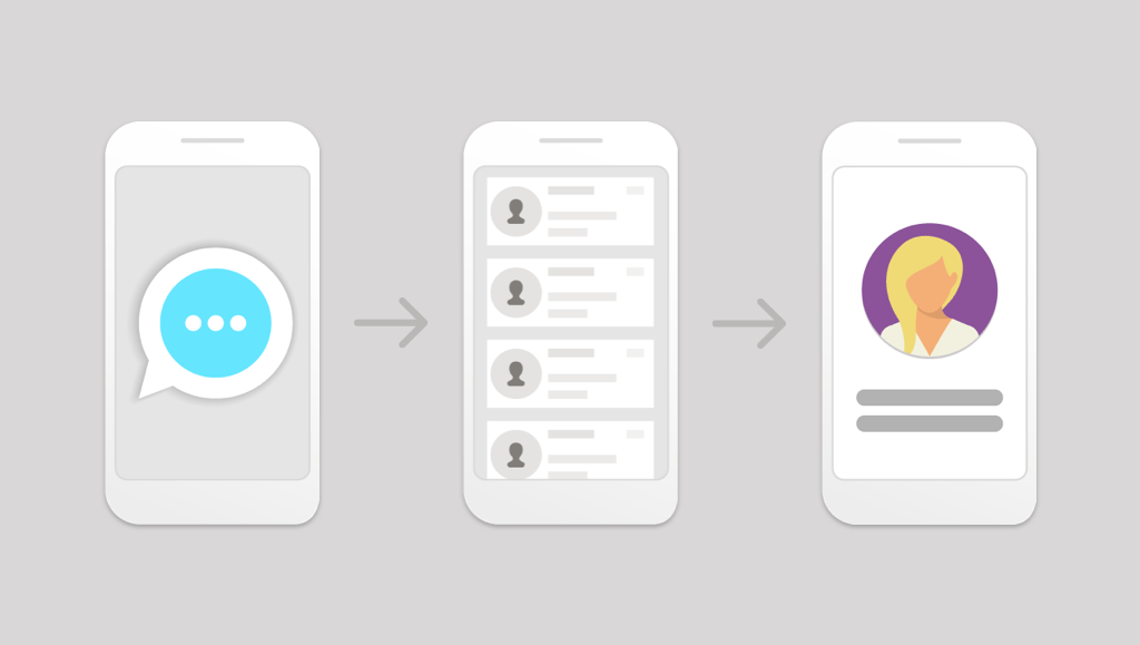
Rapid App Prototyping for UX Development

Establishing Need
For the purposes of this post we will be focusing on a new native mobile app development project.
At the beginning of many projects, the customer often is looking for a new user experience (UX) for their application, but often truly don't know exactly what they may be looking for. That's why there are many tools and processes utilized in combination during what we often call the kickoff phase of a new project. These include, but certainly not limited to:
- Stakeholder requirements gathering
- User Personas
- Mood board
- Interviews - User/stakeholders
- User Stories
All of these tools and processes help the product owner and engineers establish direction for UX and UI design. From here UX flows, stories, and wireframes are created based on the established needs. Communicating this flow to clients and/or designers, however, can be challenging in some cases. Creating UX flow diagrams, documents stepping through wireframe screens, and manual walkthroughs can be effective, but also at times fall short of truly communicating the experience intended by the team. This is a critical comprehension needed for the long-term success and perceived user happiness with the project.
This is where rapid prototyping can assist.
Purpose
The ability to actively see and engage with a mock application can potentially be invaluable. Think of it like a window into the future of the application that a user can engage. Rapid prototyping provides several benefits to the communication and comprehension of a designed application UX. This engagement can provide solutions to questions not even discovered yet or equally uncover weaknesses and strengths of the design.
The experience of creating the links or interactions between the screens and elements following the designed UX flow can also be an exploratory session for the designer/engineer. It can help clear up issues such as form fatigue, menu fatigue, form handling, menus buried, etc. The value of this exercise can be invaluable in time-savings and quality assurance of the UX.
Tools Utilized
There are a plethora of tools available out there in the world of design for wireframing, design, and prototyping. For this post we'll focus on two of these tools.
- Sketch 3 - wireframing/design, image production
- InvisionApp - rapid web-based prototyping software
Sketchup 3
Sketchup is a powerful design application for Mac OS. It offers a host of streamlined features supporting initial wireframe development all the way through hi-fidelity design mockups. Honestly Sketchup is a whole topic in itself so we will just hone in on the features applicable to image creation.
InvisionApp
Invision is a simple, straightforward web-based prototyping application that has a free option for anyone to use. The interface is clean, well-organized with drag and drop features to create and navigate rapid prototypes. These prototypes can be simple or complex in their animations and organization. The important features here include:
- the ability to import images and elements from wireframes
- a link to the demo prototype to be forwarded to any intended users
- commenting integrated into the demo to receive direct and specific feedback from all users.
Content Creation
To create screens for a prototype, simply select an artboard from the left hand menu in the interface. Once highlighted, export options are available from the right interface menu at the bottom to export as a single PNG. This will create a screen to be used in the prototype.
A prototype in Invision can also now utilize overlays and elements. This means that things like menus, dropdowns, overlays, help bubbles, etc. can be utilized in the prototype to enhance and communicate the UX. To create an element in Sketch, all layers need be organized into a group. Highlighting the group, the user can follow the same steps above in creating a PNG, or other format, image to be used in the prototype.
Once all screens and elements have been exported into a folder, they can then be uploaded into InvisionApp.
Prototype Setup
Once Invision has been accessed, the user can create a new project. For this post again we'll be focusing on a mobile platform. From here the user can then import images by drag-and-drop into Invision. Organize the order of the screens however designed and click on the first to begin editing.
Tutorials are available in Invision on how to create interface interactions, where they link to or their function, and transitions desired between all of these screens/elements. The complexity or simplicity of this UX being created in the prototype really depends on the current stage of the project and fidelity of the intended experience. For early prototypes we like to focus on simple transitions to not distract from the UX flow. Rapid prototypes are now possible in a short amount of time.
Once the prototype is established and reviewed by the team, it can then be shared with the intended user(s), whether stakeholders, designers, and/or product owner.
Utilization
Invision provides a very useful feature set with a link to the prototype. For mobile, the link is prompted to be saved to the user's dashboard as a mock app. This allows the user to open the prototype as the UX of the application intends in most cases. From here the app prototype will respond to input from the user, who now has a functioning UX/UI combination at their fingertips.
The user then has a window into the actual flow of the application being designed.
Summary
- Useful - Prototypes are your friend, aids UX development
- Simple - Images can be from any source - Sketch, Balsamiq, PS, etc.
- Powerful - Seemingly complete applications possible with a robust feature set rapidly produced
- Easy - Prototype demo links are provided for user or client distribution and use
- Informational - With added commenting function built-in, InvisionApp can dramatically assist the UX development of certain projects
